html5 css3悬停图片分割放大特效
稿源: 原创

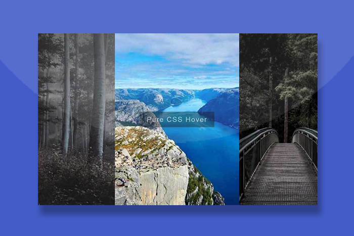
这是一款html5基于css3属性制作网格图片悬停放大分割展示动画特效。
使用方法
在页面引入以下CSS样式
<style>
.splitting-image {
  background-size: 0% 0%;
  position: relative;
  overflow: hidden;
}

.splitting-image img {
  display: block;
}

@supports (--row-size: calc( 100% / 2 )) {
  .splitting-image {
    background-size: cover;
    visibility: hidden;
    --row-size: calc(100% / var(--row-total));
    --col-size: calc(100% / var(--col-total));
  }

  .split-cell {
    background: inherit;
    position: absolute;
    overflow: hidden;
    top: calc(var(--row-size) * var(--row-index));
    left: calc(var(--col-size) * var(--col-index));
    width: calc(0.5px + var(--col-size));
    height: calc(0.5px + var(--row-size));
  }

  .split-cell__inner {
    position: absolute;
    visibility: visible;
    background: inherit;
    width: calc(100% * var(--col-total));
    height: calc(100% * var(--row-total));
    transform: translate(
      calc(-1 * var(--col-size) * var(--col-index)),
      calc(-1 * var(--row-size) * var(--row-index))
    );
  }
}
.tiler {
  position: relative;
  display: inline-block;
  cursor: pointer;
  visibility: hidden;
  width: 33.3%;
  margin: auto;
}

.tiler img {
  display: block;
  margin: auto;
  max-width: 100%;
  visibility: visible;
}

.tiler-overlay {
  background-position: center center;
  margin: auto;
  position: fixed;
  top: 1em;
  bottom: 1em;
  left: 1em;
  right: 1em;
  max-width: 1000px;
  max-height: 600px;
  -webkit-perspective: 30px;
          perspective: 30px;
}

.tiler-overlay .split-cell {
  pointer-events: none;
  opacity: 0;
  -webkit-transform: translateZ(-15px);
          transform: translateZ(-15px);
  -webkit-transform-style: preserve-3d;
          transform-style: preserve-3d;
  transition-property: opacity, -webkit-transform;
  transition-property: transform, opacity;
  transition-property: transform, opacity, -webkit-transform;
  transition-duration: 0.5s, 0.4s;
  transition-timing-function: cubic-bezier(0.65, 0.01, 0.15, 1.33);
  /* The center character index */
  --center-x: calc((var(--col-total) - 1) / 2);
  --center-y: calc((var(--row-total) - 1) / 2);
  /* Offset from center, positive & negative */
  --offset-x: calc(var(--col-index) - var(--center-x));
  --offset-y: calc(var(--row-index) - var(--center-y));
  /* Absolute distance from center, only positive */
  --distance-x: calc(
    (var(--offset-x) * var(--offset-x)) / var(--center-x)
  );
  /* Absolute distance from center, only positive */
  --distance-y: calc(
    (var(--offset-y) * var(--offset-y)) / var(--center-y)
  );
  transition-delay: calc( 0.1s * var(--distance-y) + 0.1s * var(--distance-x) );
}

.tiler-overlay {
  z-index: 2;
}

.tiler:hover .split-cell {
  -webkit-transform: scale(1);
          transform: scale(1);
  opacity: 1;
}

html {
  height: 100%;
  display: flex;
  background: #323643;
}

body {
  display: flex;
  flex-wrap: wrap;
  max-width: 800px;
  padding: 2em;
  margin: auto;
}
</style>相关插件